
Page 54 - Code Craft Computer-7
P. 54
6. Similarly, you can choose Highlight
Cells Rules > Less than.
7. A dialog box appears. Enter the value
and specify the formatting to be
applied. In this example, enter the
value as 75 in Yellow Fill with Dark
Yellow Text as the formatting option.
8. Click on the OK button.
The cells are formatted according to
the specified conditions.
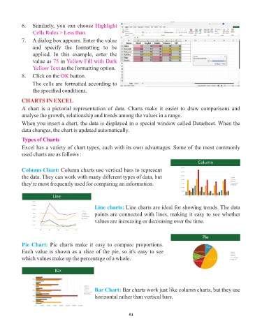
CHARTS IN EXCEL
A chart is a pictorial representation of data. Charts make it easier to draw comparisons and
analyse the growth, relationship and trends among the values in a range.
When you insert a chart, the data is displayed in a special window called Datasheet. When the
data changes, the chart is updated automatically.
Types of Charts
Excel has a variety of chart types, each with its own advantages. Some of the most commonly
used charts are as follows :
Column Chart: Column charts use vertical bars to represent
the data. They can work with many different types of data, but
they're most frequently used for comparing an information.
Line charts: Line charts are ideal for showing trends. The data
points are connected with lines, making it easy to see whether
values are increasing or decreasing over the time.
Pie Chart: Pie charts make it easy to compare proportions.
Each value is shown as a slice of the pie, so it's easy to see
which values make up the percentage of a whole.
Bar Chart: Bar charts work just like column charts, but they use
horizontal rather than vertical bars.
54